The boys are back! A couple of songs have been listened to and it’s all good. Impatience as to the purchase of the CD is happening. Rocking!! The new album, some of the older, more experienced Pearl Jammers say is kick-arse, to put it mildly. Not that the new album will make any difference to almost 80% of Pearl Jam's fans here, they who have have no PJ experience beyond Ten. Anyway, the new album rocks. Except for the cover. Coming from guys whose art has always been as great as their music, this one, kind of sticks out like a sore thumb.
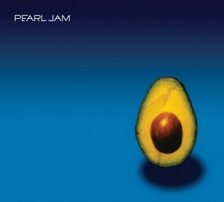
Just the name of the album (which is also the name of the band) and a butter fruit. The feathering is amateurish, the lighting and the shadows even more so? What do you graphic designers think? Is this a good cover? Is this a good design?
Wonder what Ament was thinking? Him of Ames Bros., being the brains all those awesome concert posters, previous artwork. Wonder what Eddie wants us to know? Or is telling us?Because the back cover features the same butter fruit, albeit without the seed.
Knowing Pearl Jam, its significance/ symbolism is something that will hit you right between your eyes when in the middle of the night when you’re savouring a cool breeze when you’re racing through half-empty streets after a long session with the boys and the songs from this album are playing in your head and the lyrics are gently drumming the sides of your skull. And then you’ll wonder “why did I not get this before?” and of course most likely you’ll be wrong. But still.
And while we’re on the topic, here is all those hundreds of great PJ concerts you’ve missed over all those years, in one place for your listening pleasure. Each concert in full, in totality. Eddie’s speeches and ramblings included. Crowd remarks, applauses, screams and all. A few nice radio interviews as well. Not to mention those live-only covers. So till we get our hands on the new album, let us make do with this. Turn those speakers on. And LISTEN!!
Someday, we’ll figure out the butter fruit.


4 comments:
I dunno. The rockier songs are well...y'knowhow tere are suprisingly amteurish/uncreative touches in the graphic design? The music strikes me that way, for what it's worth. The slower songs are okay, but PJ has alwaysbeen good at that stuff. I may revise thisopinion after more listens,of course.
Ah, but then again, it just might be PJ's way of saying "B*lls to you!" to the world:D
http://en.wikipedia.org/wiki/Avocado#Names
Bravo dear Glumster. i must doff my topi to your skills. Balls. It’s one of the reasons why I called it Butter Fruit Jam, which I anyway call this particular fruit. Balls Jam would’ve been too…loaded a term eh? Y’know, they could actually be saying “balls to you, lawyers.” Ref. the wiki page. Balls Jam whatta boner that would've been?!!
Or maybe it’s just a mind-fuck for those who like to overanalyse. Still doesn’t change the fact that the design is amateurish.
And I got hold of the album at the landmark. Interested inna copy? Actually buy the album, the liner notes and the sleeve will make it worth your while. Not to mention the music. and there’s nothing amateurish about them. No way!
Amateurish may have been wrong - they seem kinda uninsipired inthe rocky stuff - I'll give it more spins and try to give you precise examples. Will certainly buy the album!
Post a Comment